Every Font Was Someone’s Hand: Digging Up the Typefaces the Web Threw Away
Photo: Lalsing Vanya Valavi from Dhadgaon (Akrani), Nandurbar, CC0, via Wikimedia Commons
In a spare bedroom in Dayton, a man is redrawing the lowercase “g.”
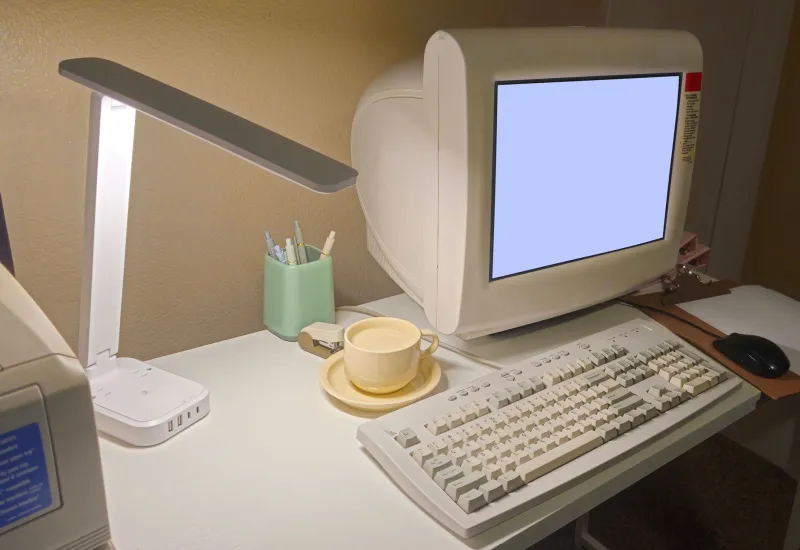
He has been at it for two hours. The reference is a screenshot, 640 by 480, saved in 1998 by someone who is now unreachable, of a webpage that no longer exists, rendered in a system font that shipped on a machine that has since been recycled. The letter is nine pixels tall. He is trying to decide whether the descender should hook left or drop straight down, because the screenshot is compressed and the difference is one pixel, and one pixel is the whole argument.
The Look of a Vanished Place
We talk about the early web as a set of images — the tiled backgrounds, the marquees, the hit counters. But the thing that actually made those pages feel the way they felt was the typeface, and the typeface was almost never a choice. It was whatever the operating system handed you. The blocky sans-serif of one platform, the slightly rounder one of another, the specific chunky weight that made a headline look like a headline in 1996 and looks like nothing at all now.
A small, dispersed group of typographers and hobbyists has spent years trying to get those faces back. Not as nostalgia, exactly. As documentation. When a font disappears, the pages that used it do not become retro — they become illegible, because the browser swaps in something modern and the page loses the proportions it was designed around. A website built for a nine-pixel-tall letter looks broken in a typeface designed for a retina display.
Bitmaps Don’t Age Gracefully
The technical problem is that early screen fonts were not scalable outlines. They were bitmaps: hand-tuned grids of pixels, one file per size, drawn by someone who was making judgment calls about legibility on a monitor most of us would now find unbearable. You cannot zoom a bitmap. You cannot convert it cleanly to an outline without decisions being made on your behalf.
So the restoration work is really an argument about fidelity. One camp wants a pixel-perfect reproduction — the letter exactly as it appeared at 12 pixels, stubby serifs and all, warts preserved because the warts are the evidence. The other camp wants a usable modern font that captures the spirit at any size, which means redrawing, smoothing, adding weights that never existed. The two camps are polite to each other and privately think the other is missing the point.
A Palette With No Documentation
The harder problem is provenance. Fonts are licensed objects. A typeface lifted from an old ROM and redistributed is a legal question nobody in this scene enjoys answering, and most projects end up in a gray zone: available for study, described in detail, never quite shipped as a downloadable file with a name you would recognize.
So the archives fill up with something stranger than a font library. Specimen sheets. Pixel grids. Comparison charts showing the same word rendered across six platforms, annotated by people who can identify a typeface from a single capital “R” the way birders identify a warbler from three notes. There are arguments in forum threads that stretch across years about whether a particular curve was an intentional design choice or an artifact of the rendering engine.
The Look of a Letter Still Matters
Here is the part that is easy to miss. The people doing this are not trying to restore old websites because they think 1997 was better. They are trying to keep a visual record intact — to make sure that when someone in 2040 wants to know what an American small-business homepage looked like in the dial-up era, there is a way to see it as it was, not as the modern web has repainted it.
Type is the most invisible part of that record, which is exactly why it goes first. Images get archived. Screenshots get saved. The typeface underneath gets forgotten until a page renders and something feels subtly, unexplainably wrong.
One Pixel at a Time
The man in Dayton makes his decision. The descender hooks left. He saves the file, names it with a version number, and posts a four-line note to a forum where maybe a dozen people will read it and two will care.
Somewhere, a thumbnail of a dead page renders a little truer. That is the entire victory, and it is enough.